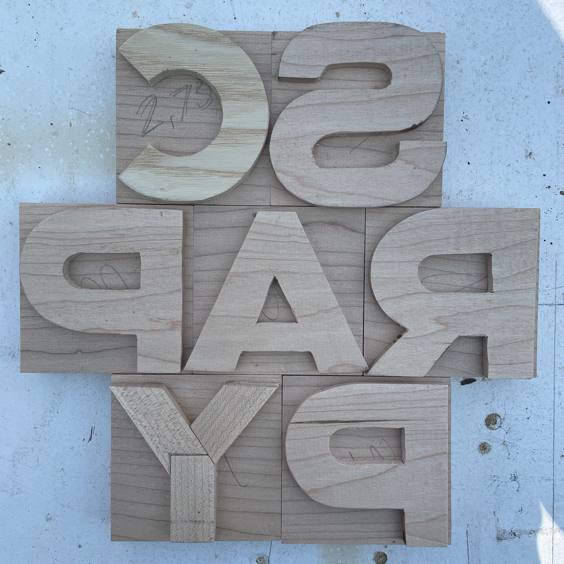
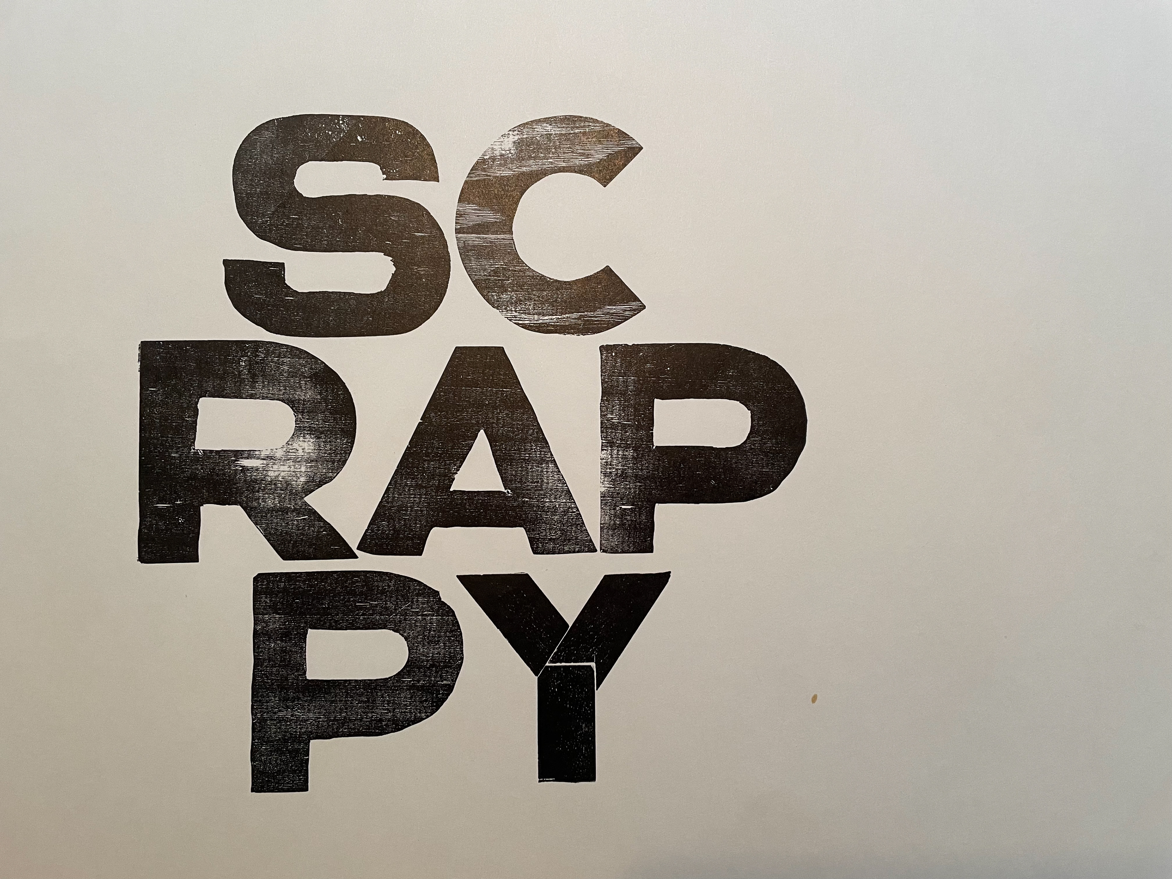
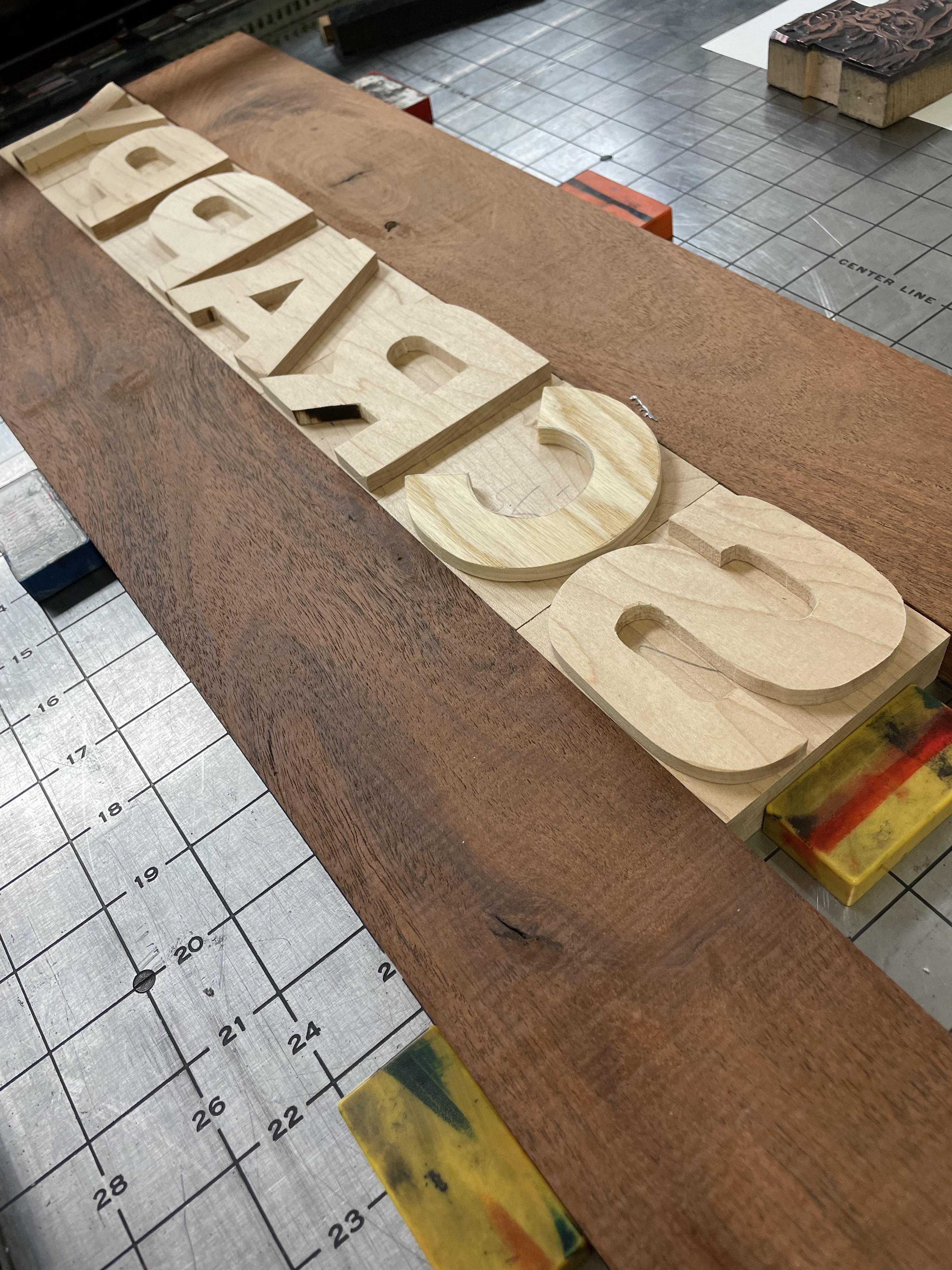
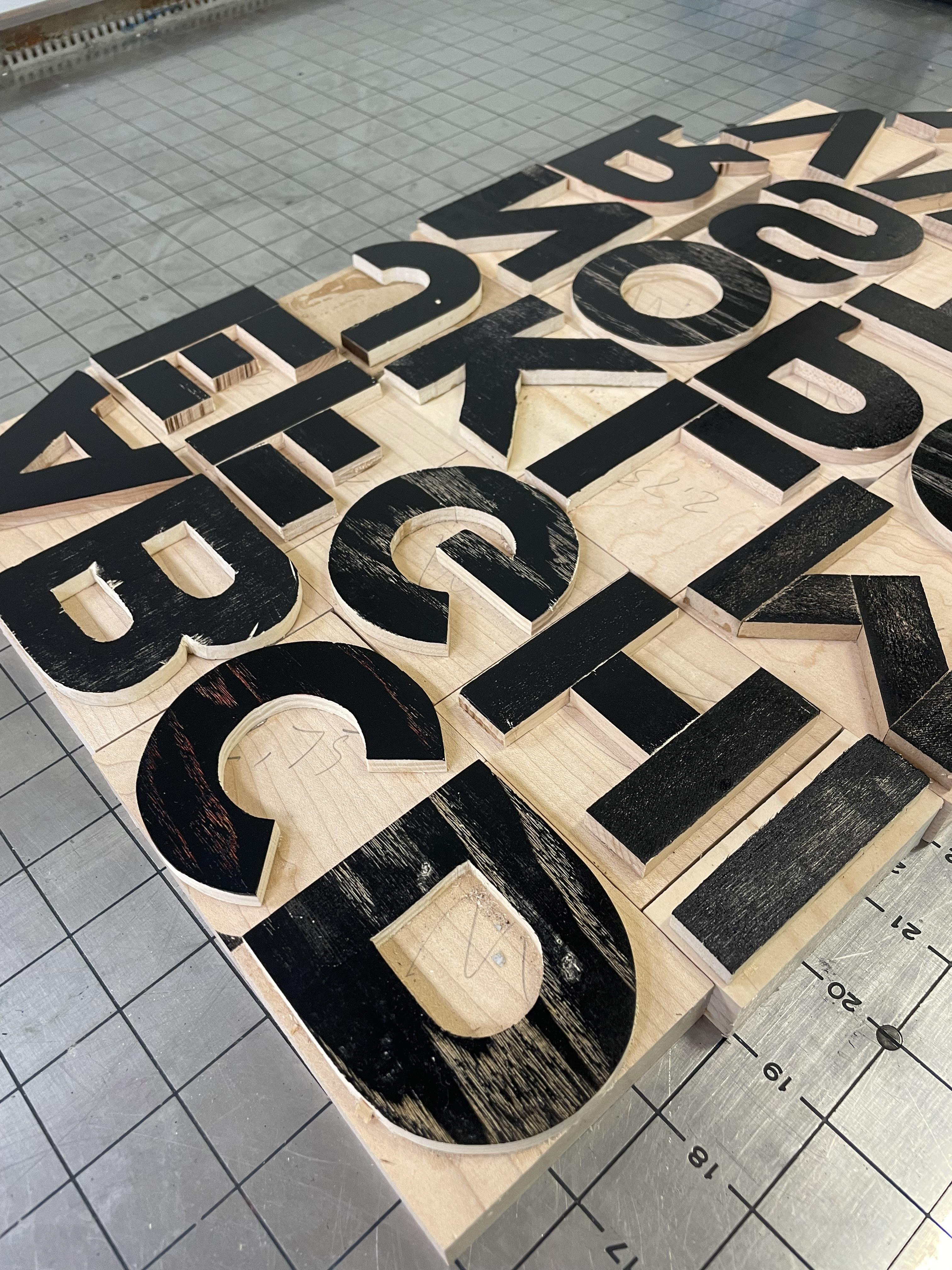
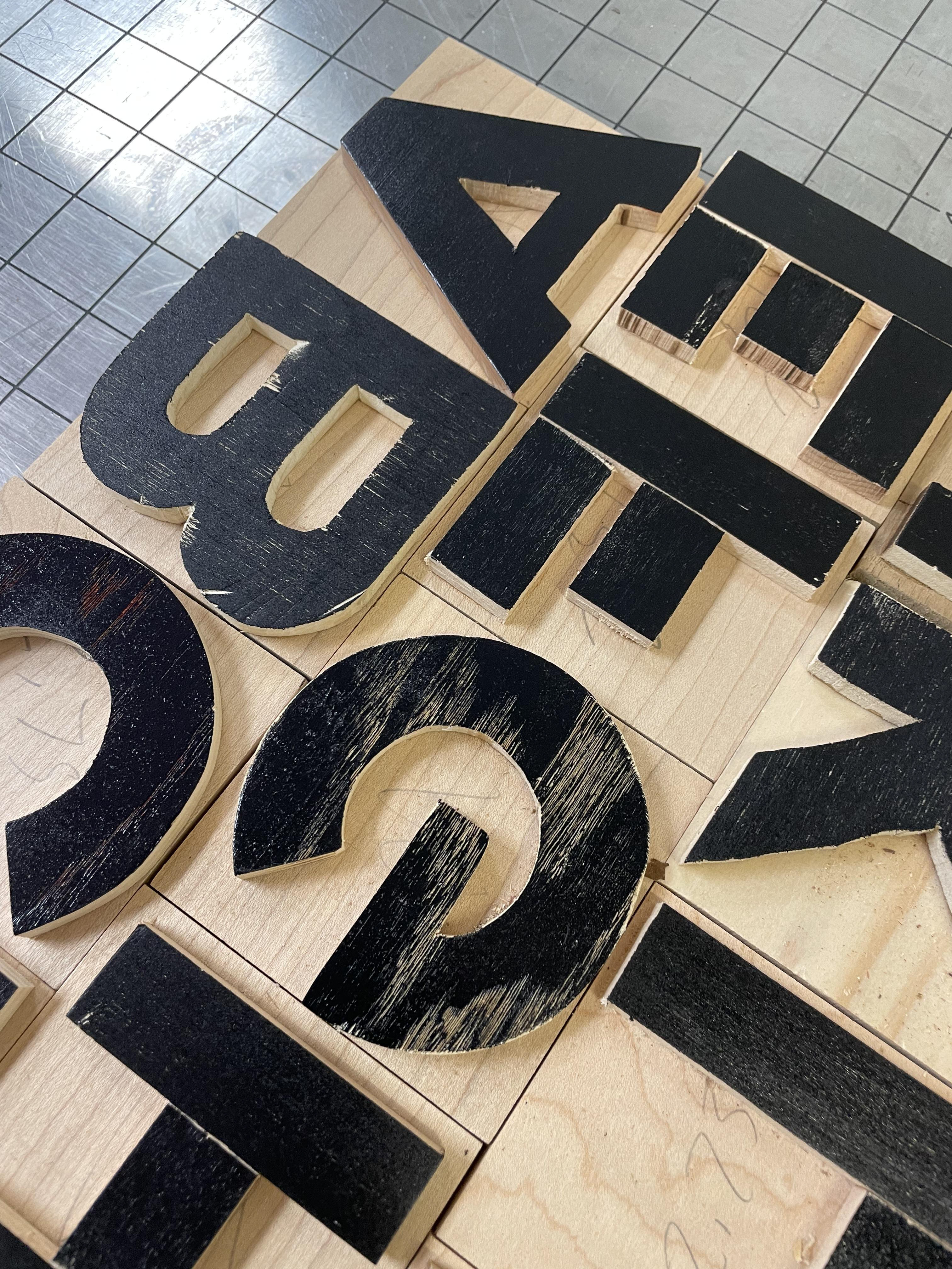
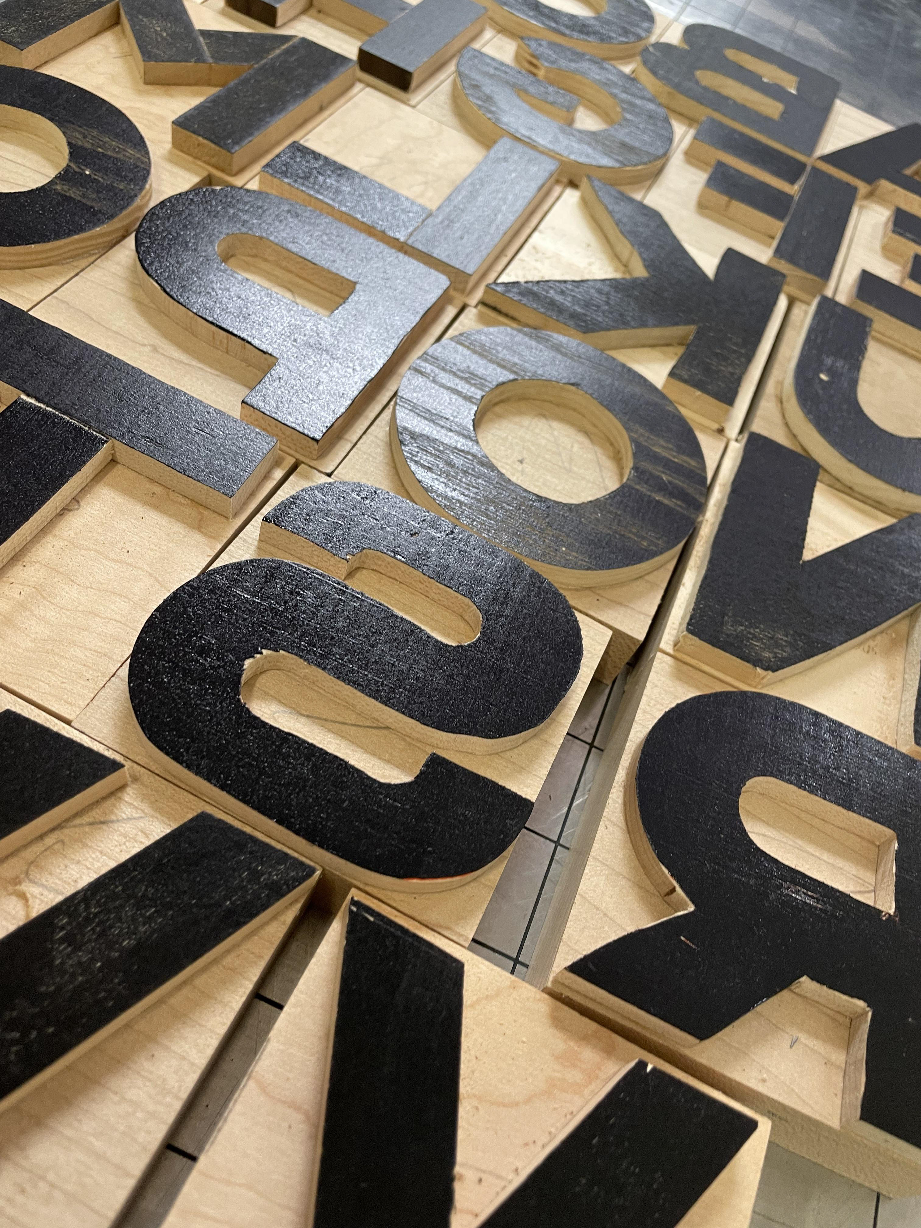
A few years ago I thought through and designed a very rough square-based typeface with the idea that it could be made from scrap wood from other projects. It uses 5/8" as a basis for a stroke thickness, and all other dimensions fall out from that rule. This year I got around to making the physical. As a volunteer at the Cincinnati Type and Print Museum, I finally had easy access to a printing facility minutes from my house. Why do this? Why not do this!
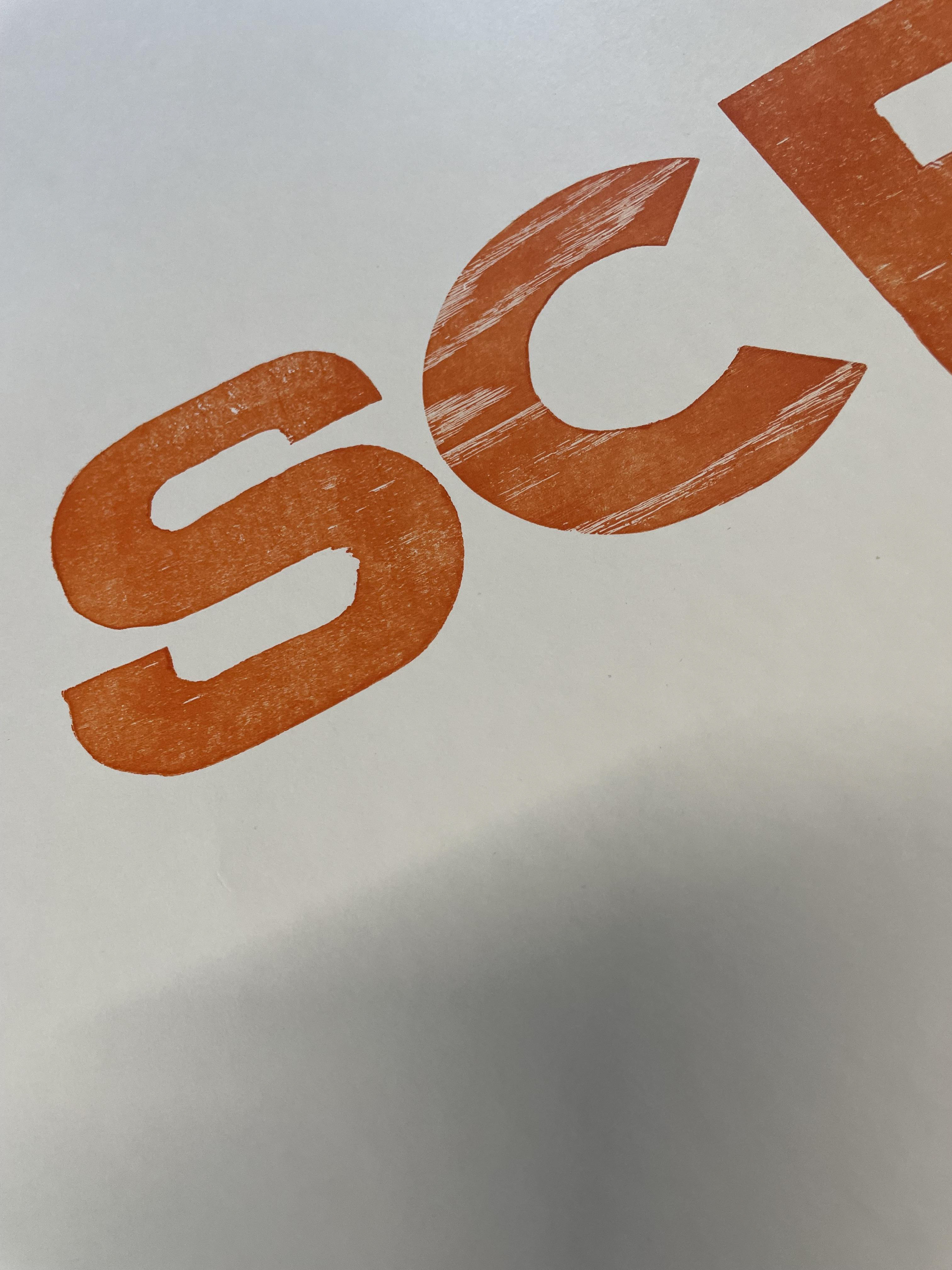
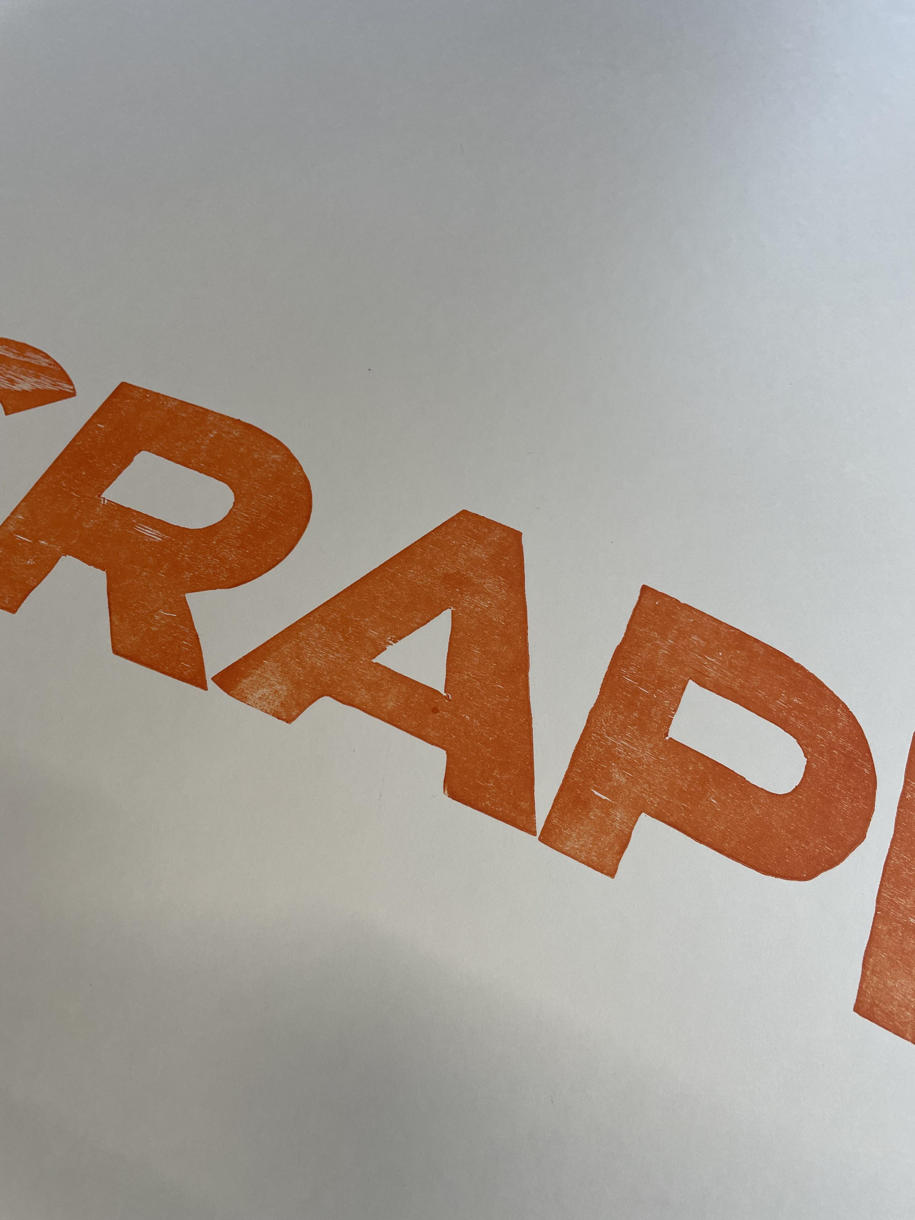
This type is rough and varied in texture by different "SCRAP" woods I used for each block. To me there is beauty in the roughness and imperfection. We put things out into the world and see what happens. As part of this concept, I do plan on sharing this font - the physical - with other printers and see what they come up with.
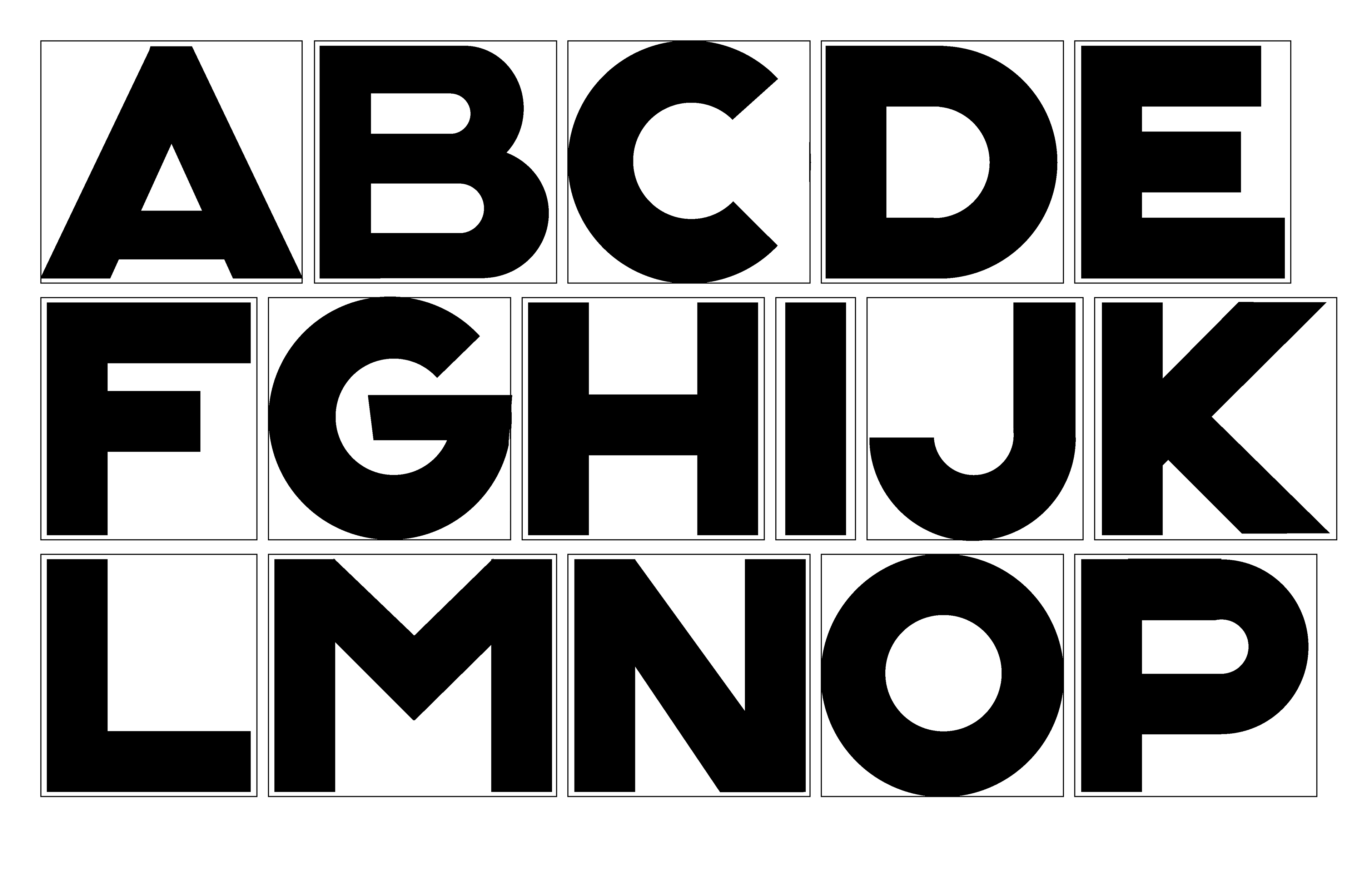
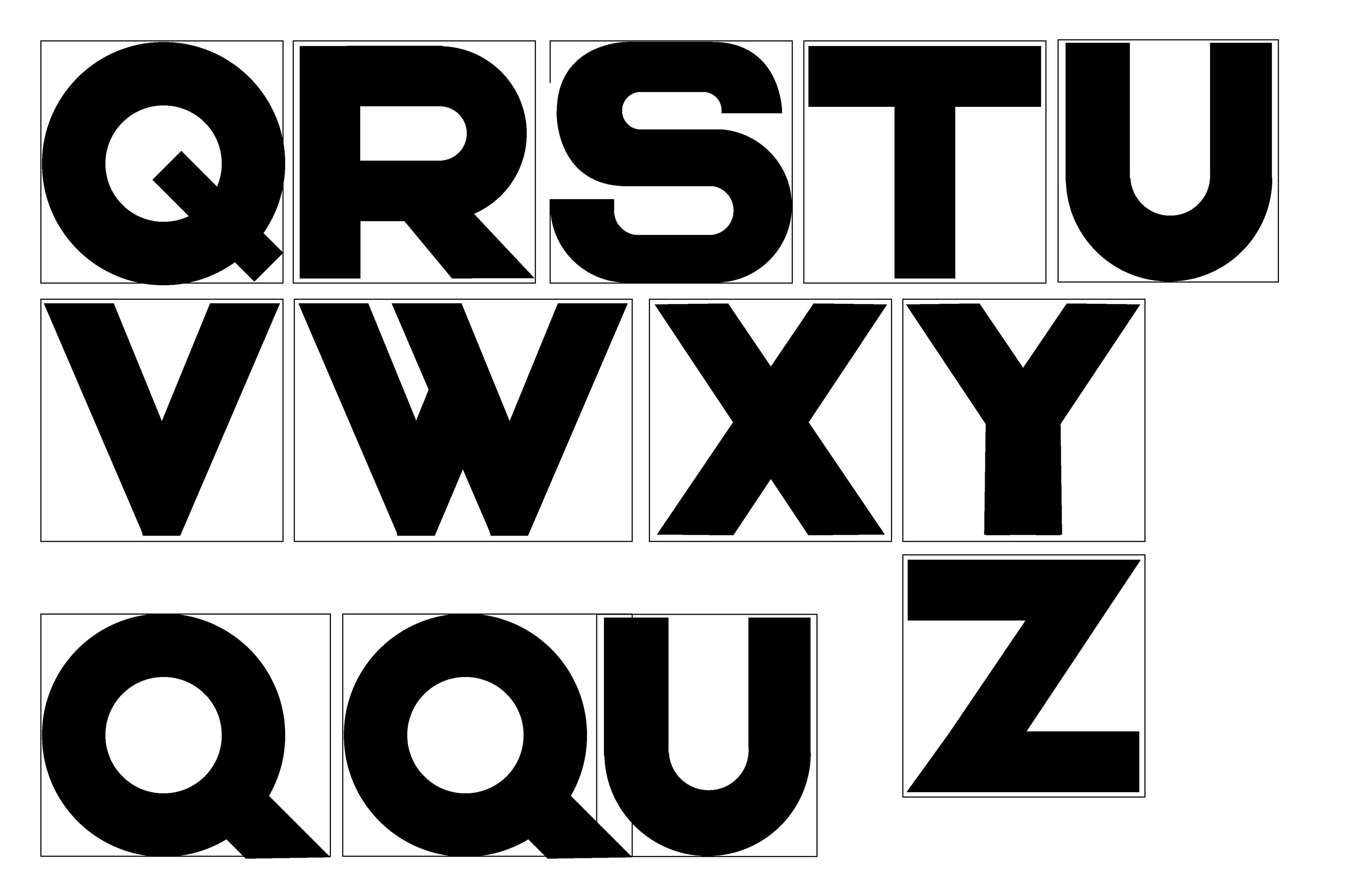
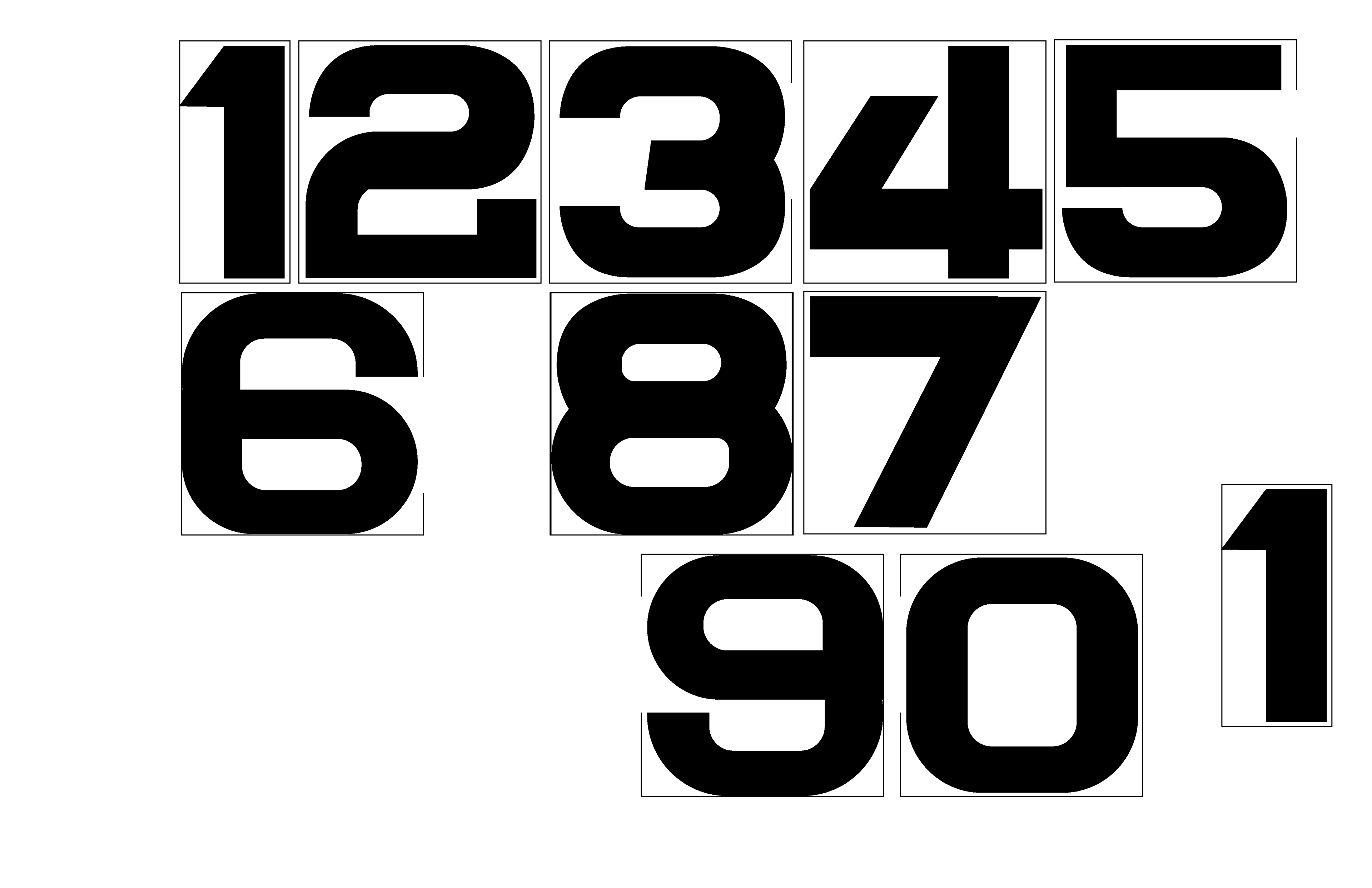
Above are the early digital workings of the letter forms. I used these to cut or build each font to size. Learning along the way that even as I tried to be precise, my tools and materials had other ideas, and me, that's where the beauty come from.
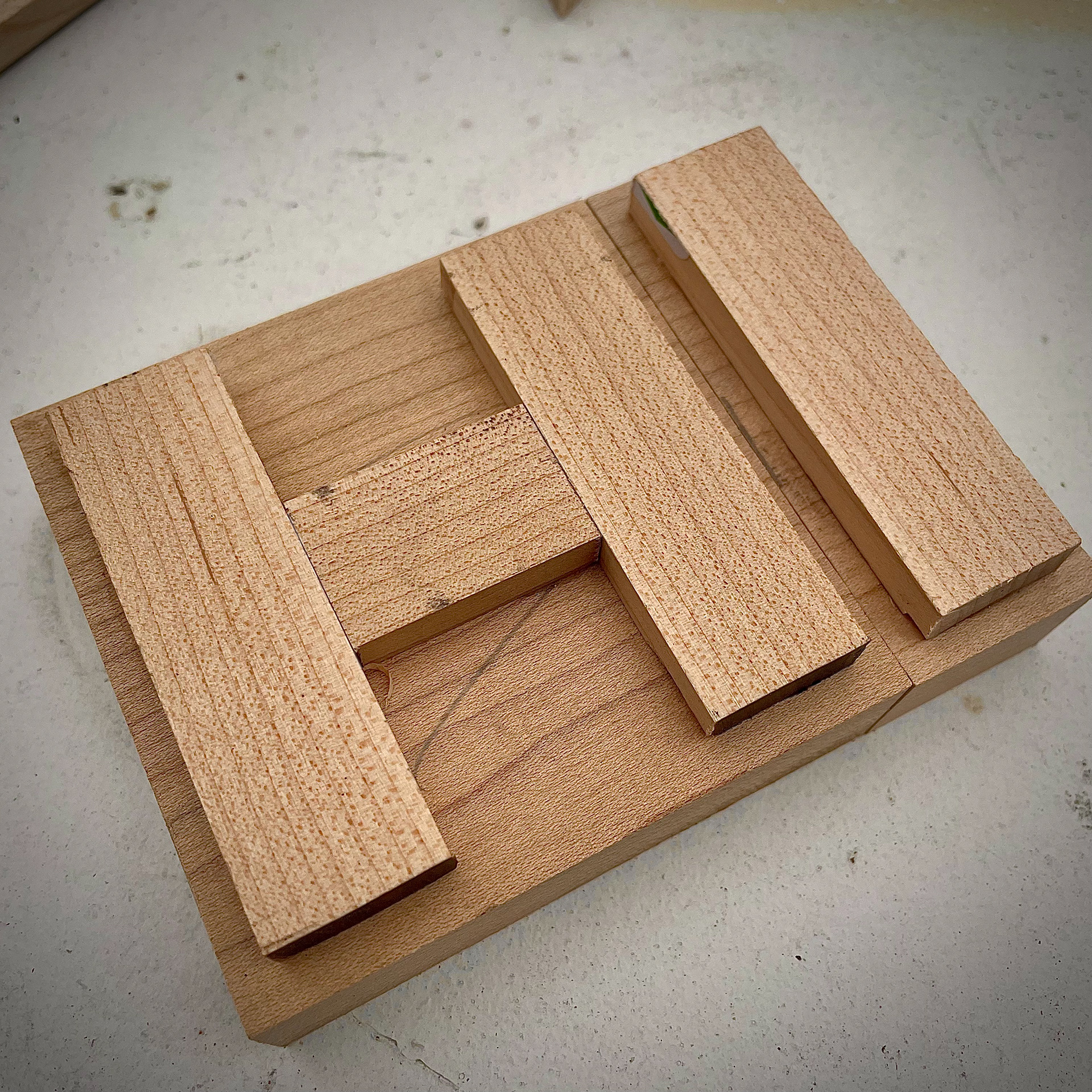

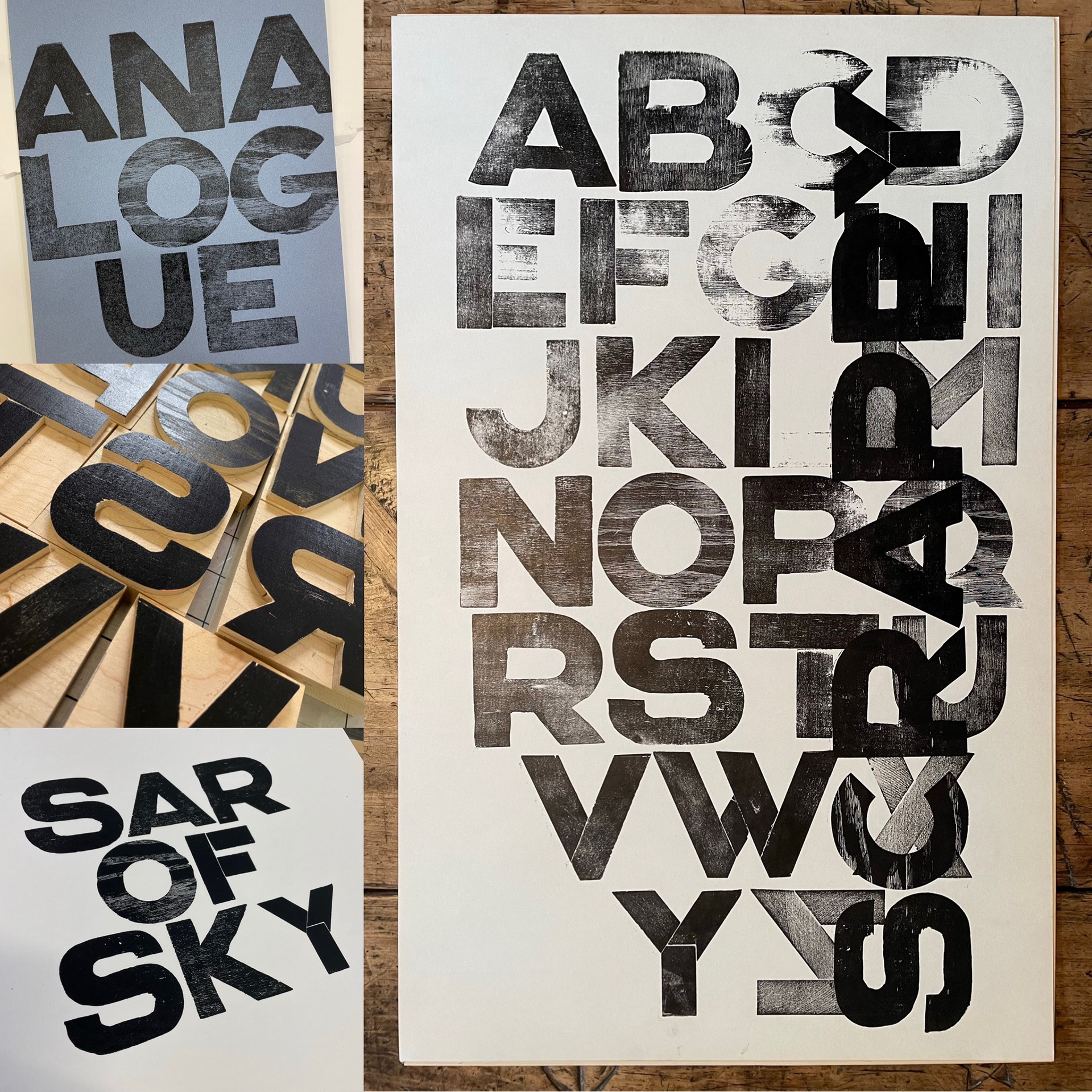

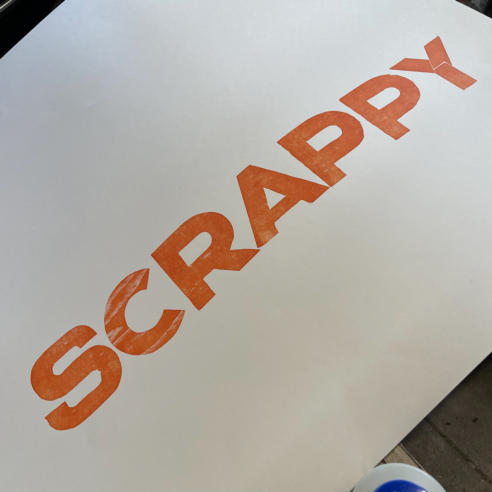
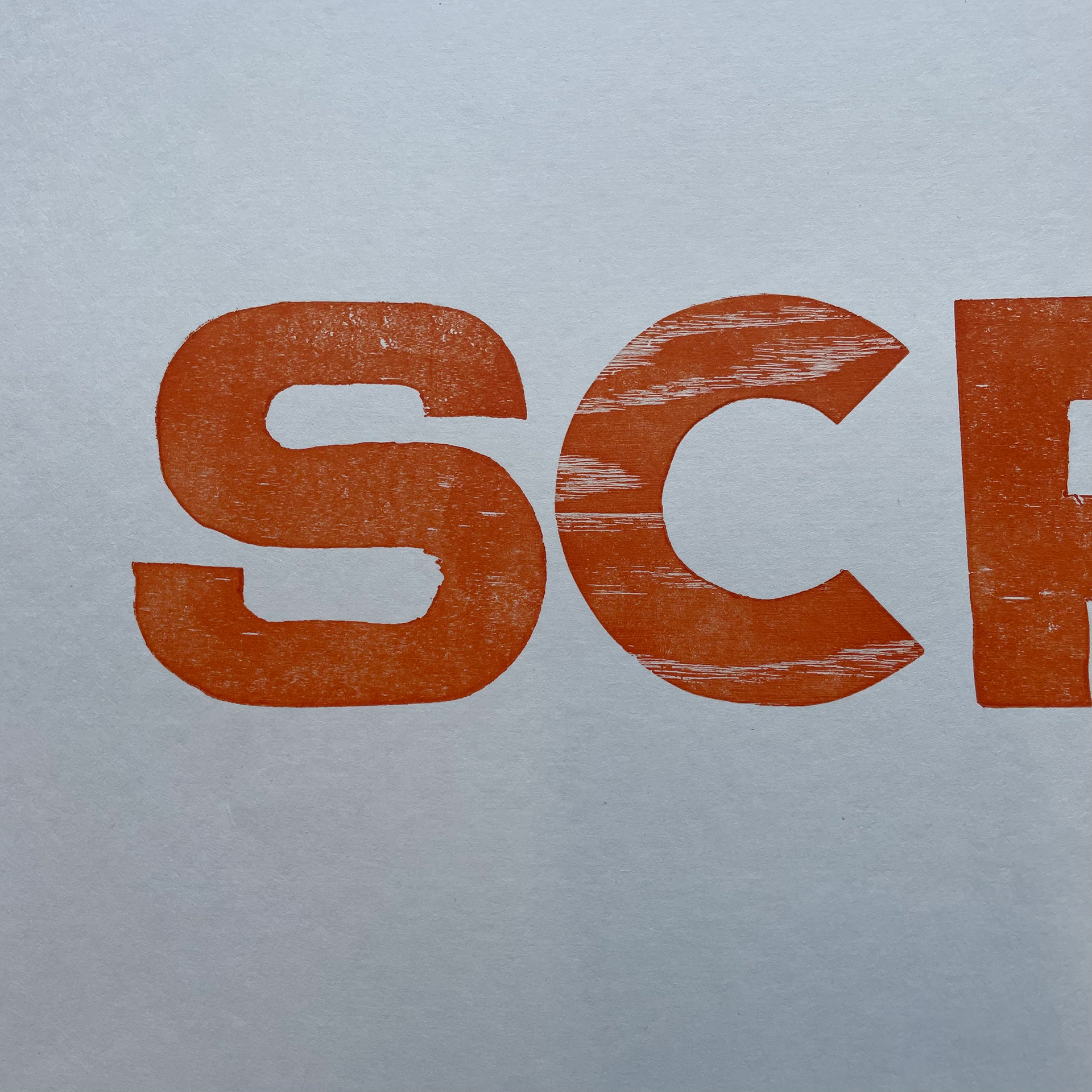
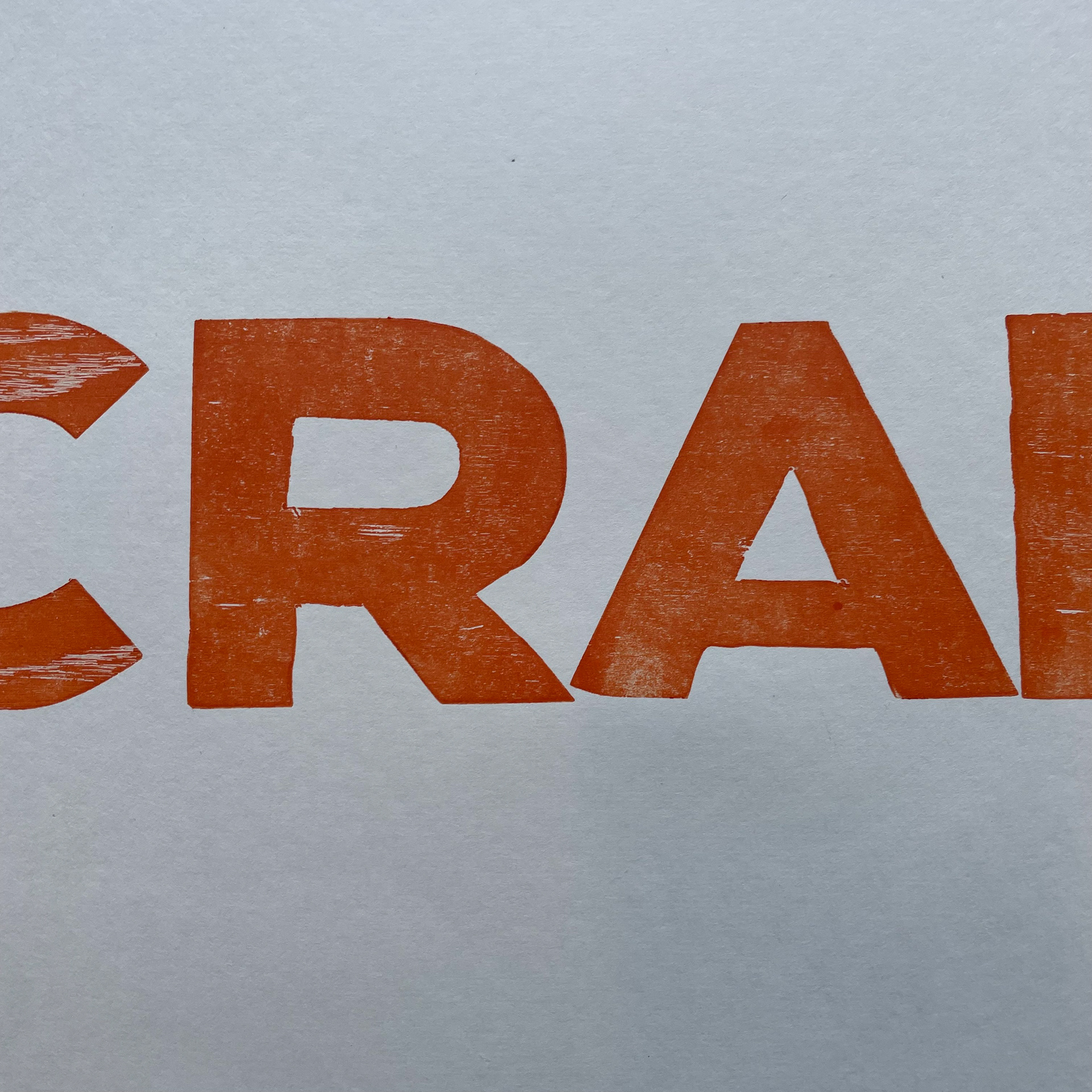
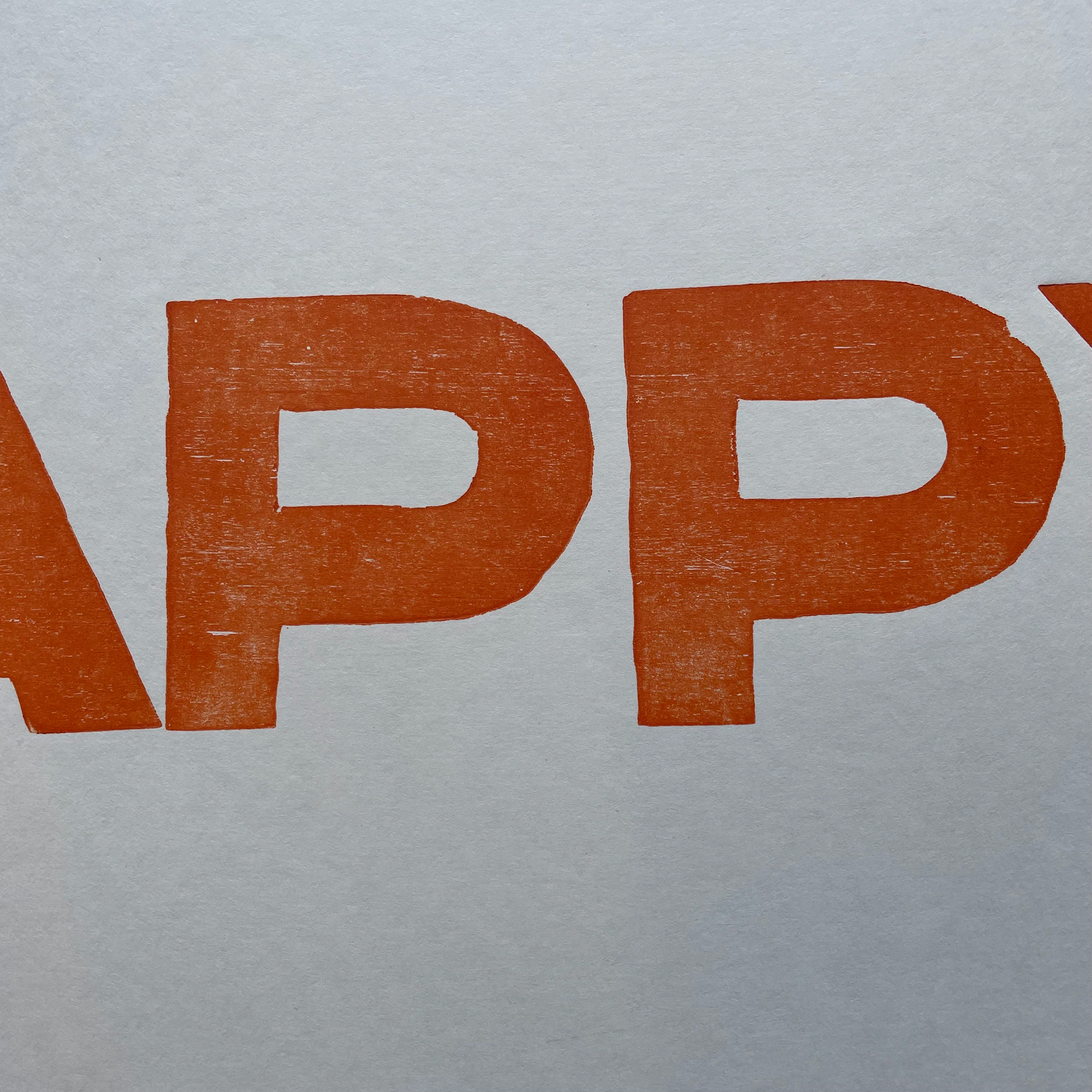
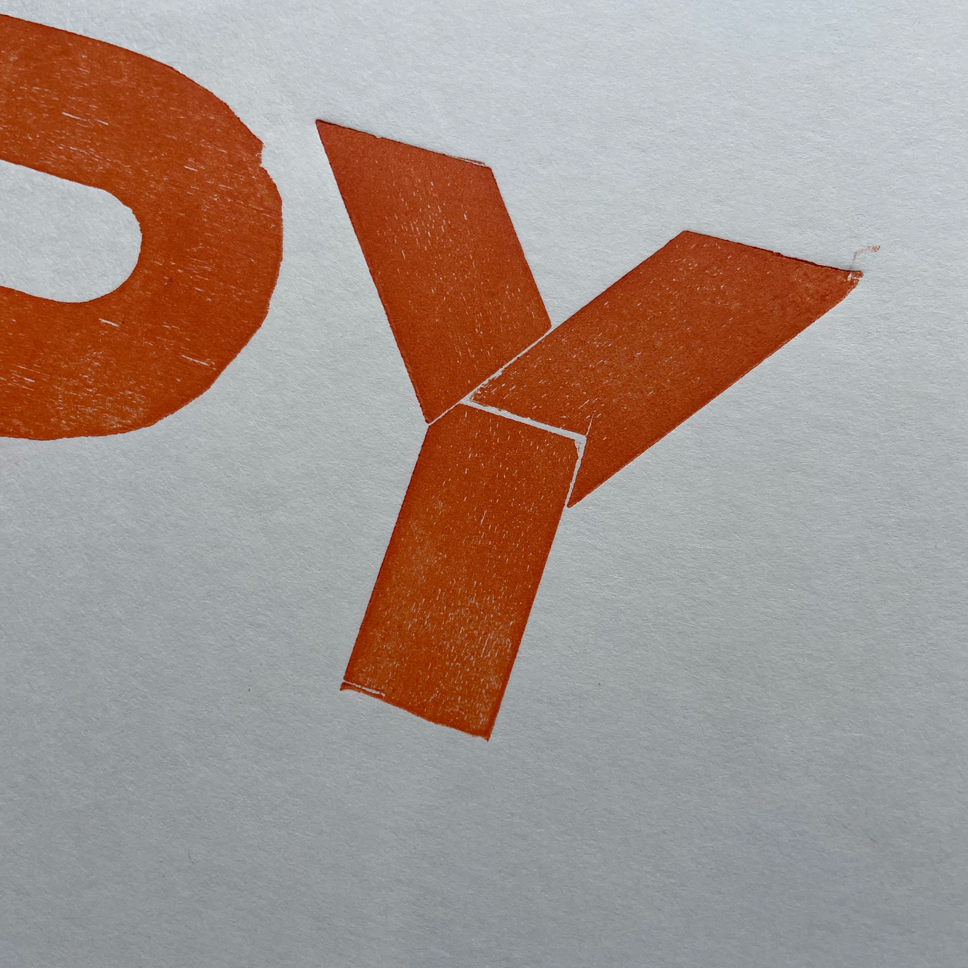


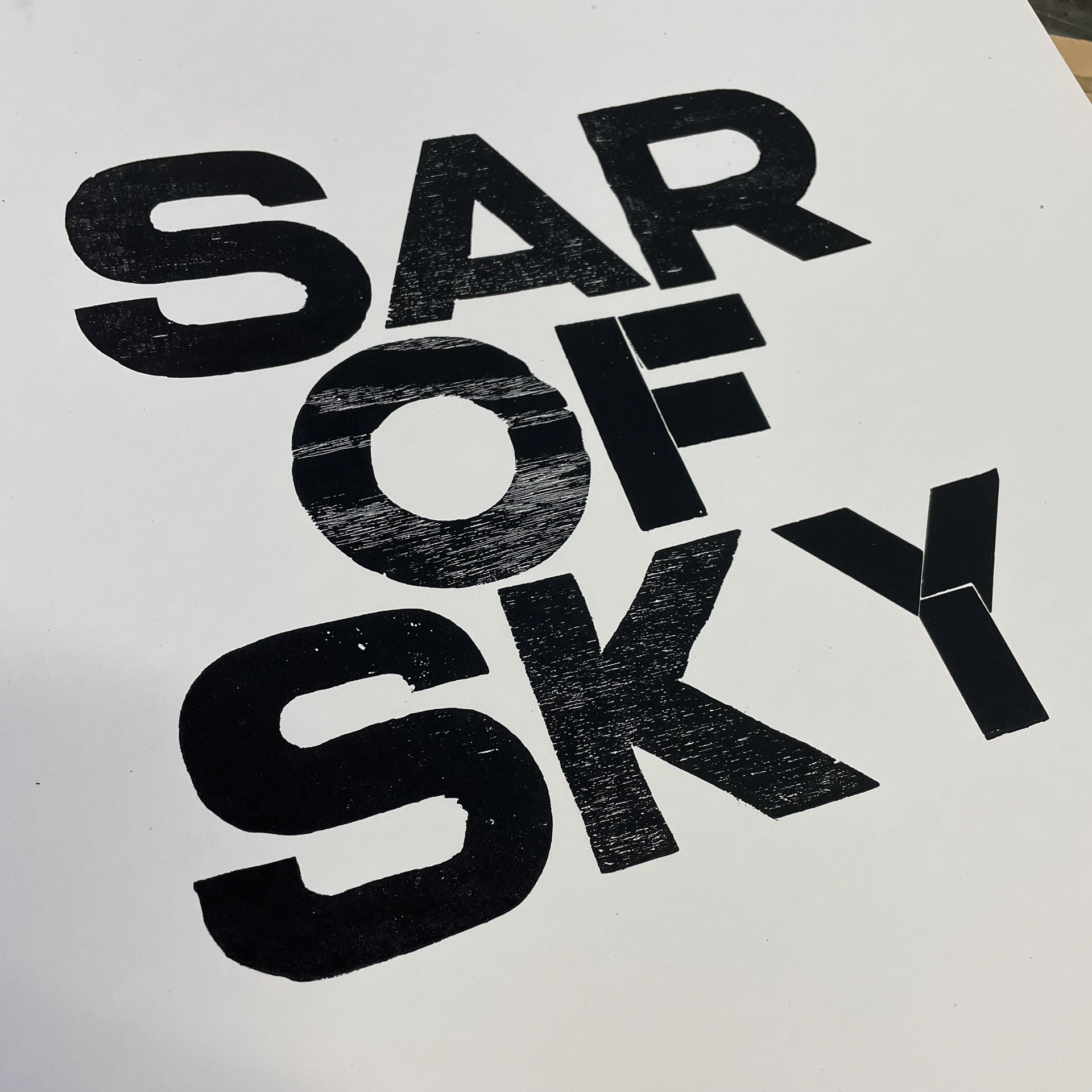
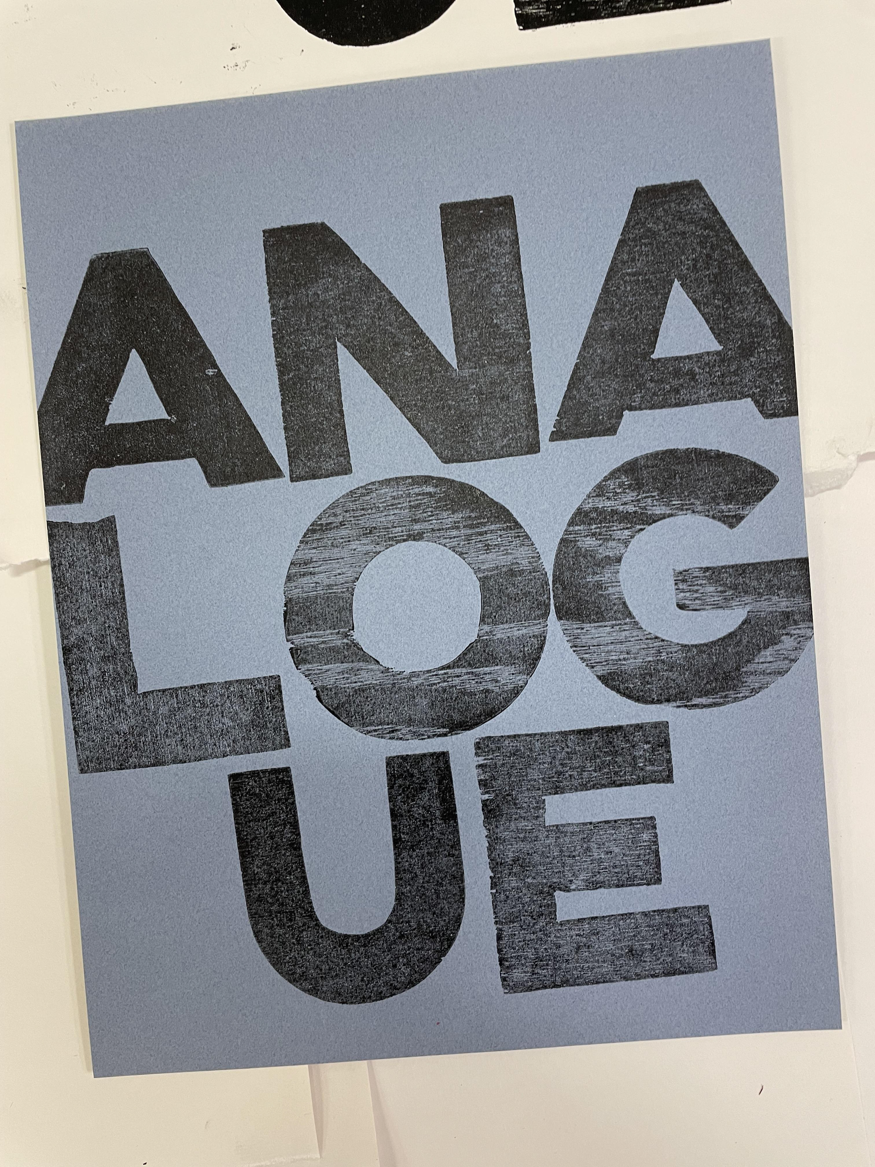
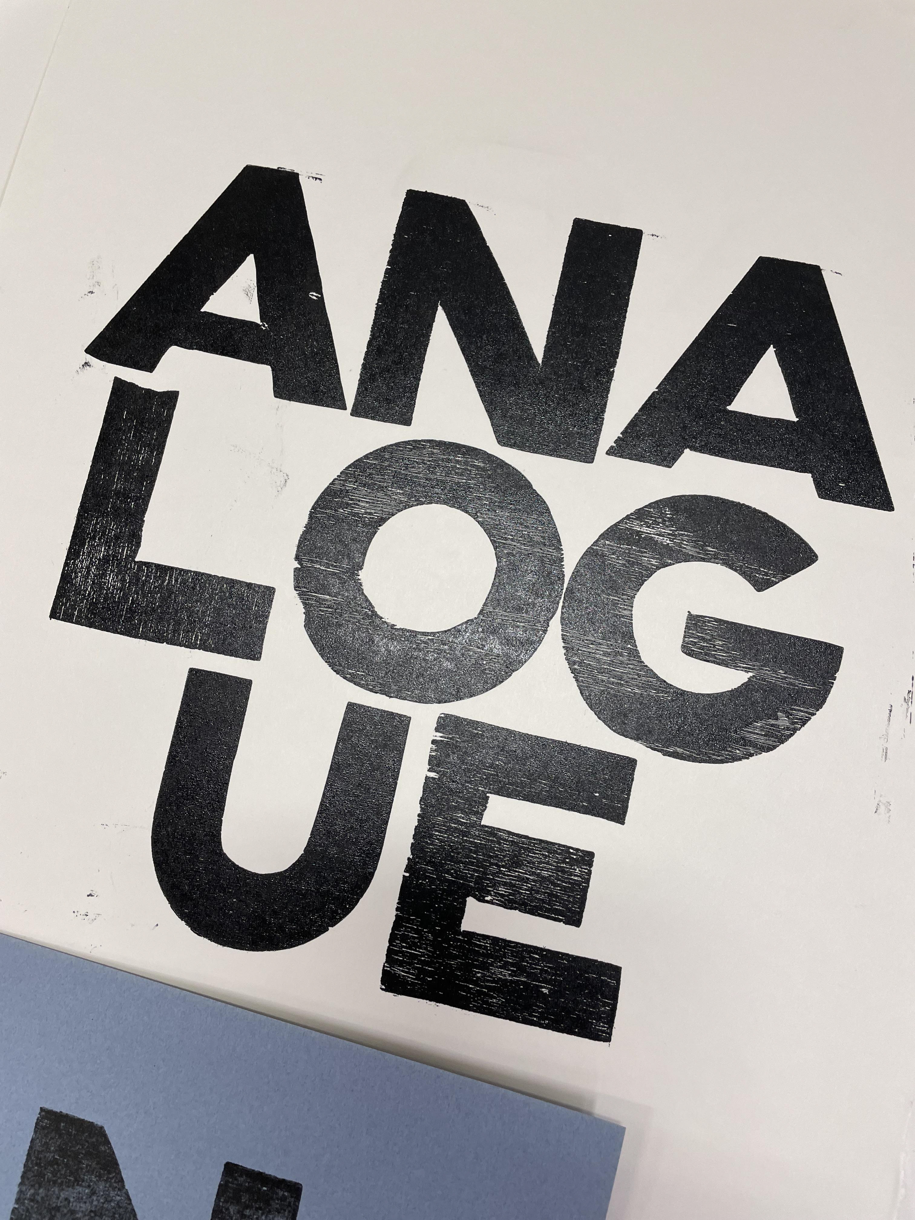
By committing to this project, I discovered the elemental power of language and letters; in their combinations, we make messages every day. Basic "DUHH" sort of stuff, but I think even the best of us take this power for granted.
I've got to go make more type now.
